NASA Earth Data Gets Local for National Public Health Week
Ozone monitoring in a nationwide City Health Dashboard and tracking red tides are two NASA projects that fit into the theme of this year’s National Public Health Week, sponsored by American Public Health Association, from April 4 to April 10, 2022. The theme for 2022 is “Public Health is Where You Are,” intended to encourage a closer look at how our surrounding environment impacts community health.
From assessing changes in coastal water quality to city air quality dashboards, NASA’s Health and Air Quality program area is dedicated to working with community partners and stakeholders to share NASA Earth observations that to help inform local decision making for protecting communities’ health.
Ozone Mapping for City Health
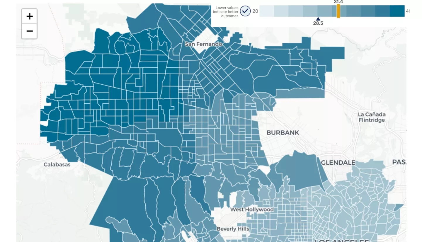
Earth science data from ground observations and computer models are now included into the existing U.S. City Health Dashboard. Ozone is a harmful air pollutant that can have dangerous respiratory effects even for otherwise healthy individuals, but especially for vulnerable communities like children with asthma and the elderly. More than 80% of U.S. residents live in urban areas, where ozone pollution is usually at higher levels.
The City Health Dashboard is a free online platform for communities and city leaders to access regularly updated data on factors that impact health, localized to their neighborhood and city boundaries for over 750 cities in the U.S. The City Health Dashboard is maintained by researchers at NYU Grossman School of Medicine.
Daniel Tong leads the project on including the new ozone monitoring data as part of a Health and Air Quality Applied Sciences Team (HAQAST) project. Tong is an associate professor at George Mason University and associate director of its Center for Spatial Information Science and Systems.
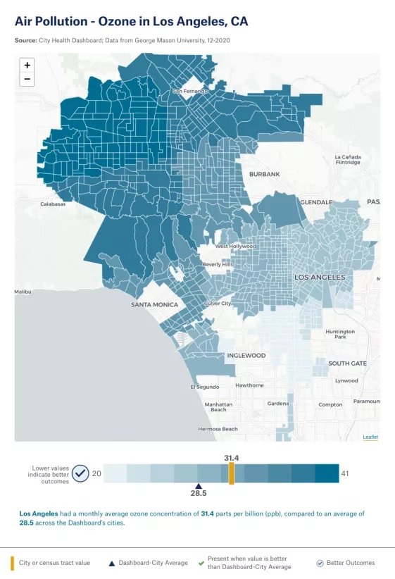
Part of his HAQAST-funded project is to improve and share air quality metrics and forecasts with many stakeholders, including the City Health Dashboard. His team merged ground observations from the Environmental Protection Agency’s Air Quality System network with computer model predictions from the National Oceanic and Atmospheric Administration (NOAA) National Air Quality Forecast Capability (NAQFC), to prepare a data package on air quality metrics customized for City Health Dashboard.
Now, local city agency leaders and other decision makers can access these important data on neighborhood-level air pollution – along with 40 other metrics of health like life expectancy, children in poverty, and uninsured rates – in their communities, which can help inform actions to reduce pollution and protect public health. The City Health Dashboard’s Impact Stories share examples of how similar data have been used across the country. These important neighborhood-level data can also be downloaded from the Dashboard for further analysis and visualization.
Studying Local Red Tides
Another way that the use of Earth observations can have a local impact is through the study of harmful algal blooms (HABs) that appear each year along Florida’s Gulf Coast. As a result of the accumulation of the dinoflagellate Karenia brevis, these HABs deplete oxygen concentrations in water, negatively affecting fish and marine mammals. Toxins produced by the blooms cause skin irritation, or when aerosolized, respiratory distress in humans. These blooms limit tourism and recreational activities, impacting economic development in Florida beach communities.
Richard Stumpf, an oceanographer with NOAA, led a study supported by the Health and Air Quality program area to analyze over 60 years of Earth observations and create both a bloom severity index and a respiratory irritation index.
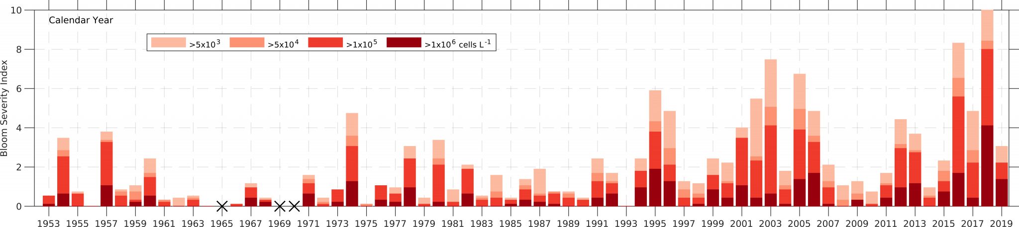
As blooms typically form in August and continue through the winter, Stumpf’s team found that higher-than-usual offshore winds can decrease the respiratory impact of these blooms on communities. That’s why it’s important to incorporate satellite data, like observations from NASA’s Terra and Aqua satellites, with local ground measurements and modeling to assess both the severity of a bloom and appropriately warn the public of potential impacts. These findings can help managers and decision makers both evaluate the risks along the coast during blooms as well as design systems to better respond to and mitigate bloom impacts.
Scientific and community partnerships are key to leveraging resources and developing timely public health initiatives that meet community needs. The goal of better understanding the environmental risks that affect our communities – such as exposure to ozone pollution or HABs – can create stronger and more resilient communities that are equipped to manage emerging public health threats, and ultimately protect community health.
To learn more about how NASA data contributes to local health decisions, visit the Health and Air Quality homepage on the Applied Sciences site.