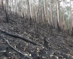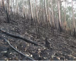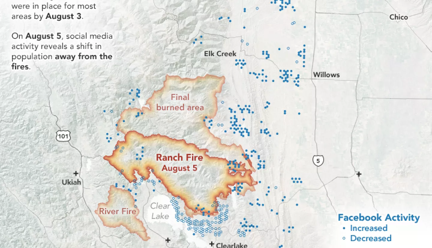
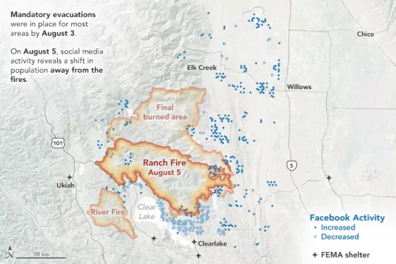
One of California’s biggest wildfires began burning in July 2018, in the Mendocino National Forest. As the fire quickly spread, mandatory evacuations forced thousands of people to leave their homes. Researchers used satellites and other remote sensing instruments to track the extent of the fire and smoke from above. But to monitor the movement of people, they turned to social media.
Facebook’s disaster maps project uses anonymous data to show population densities and movements in an area. Using this dataset, NASA-funded researchers could see where people evacuated to.
The researchers found that people evacuated to a variety of options for shelter. And for most areas, they returned back to their homes when the evacuation orders were lifted.
This bounce back can be an important indicator that the evacuated area is safe to move back into. But recovery isn’t always so quick. Facebook data from California’s Camp Fire in November 2018 showed that much of the evacuated area did not see the same population return. That fire destroyed more than 18,000 structures. In comparison, the Mendocino Complex fire destroyed less than 300 structures.
This work demonstrates how social media data can complement Earth observations tracking disasters. Better understanding of evacuation and recovery patterns can inform emergency response efforts.
More information available at the NASA Earth Observatory story Understanding Evacuation Patterns with Social Media.